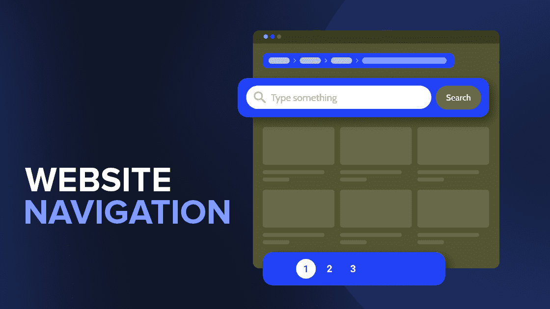
Why Website Navigation Matters:
Website navigation is the compass that guides users through the vast desert of the
internet, leading them to your unique virtual territory. Just imagine a cluttered shop
with poorly labeled sections, where you struggle to find your favorite products.
The Perils of Poor Navigation:
- In the realm of website navigation, numerous pitfalls can hinder the user experience.
- A cluttered and complex navigation structure, unclear labels, and unresponsive design can confuse and alienate users.
- Slow loading times and neglecting accessibility features are also detrimental.
- Imagine losing potential customers because they can't easily find what they need or are frustrated by the design.
- It's clear that addressing website navigation is not just a trend but a necessity in the realm of modern website trends and user experience.
If your website is going through this, here’s what you need to do:
- Balancing aesthetics and functionality in website navigation can be a
challenge. - A visually appealing website is essential, but it must also offer seamless user
interaction. The key is finding harmony. - Navigation elements should complement the overall design theme while
remaining highly functional and intuitive. - Clear typography, appropriate color schemes, and well-designed icons can
enhance aesthetics without compromising usability. - Regular usability testing and feedback collection are crucial to strike the right
balance and create a website design that embodies the best website
development services.

Navigation Trends that Transform User Experience:
1. Consistency: The Bedrock of User-Friendly Website Navigation
- Define your brand’s mission, values, and unique selling points.
- Ensure consistency in messaging across all online platforms.
2. Embracing the Hamburger Menu: Simplicity at its Best
- The humble hamburger menu, with its three simple lines, has evolved from controversy to a web design standard.
- It discreetly conceals the navigation menu and presents the user with a universally recognized, clean interface – a key aspect of navigation UX and modern website trends.
3. Animation: Adding Life to Navigation UX
- Subtle animations can transform navigation into an interactive and delightful journey.
- The key is moderation to ensure a smooth browsing experience that showcases the best website development services.
4. Bottom Navigation: Web Page Navigation Designed for Thumbs
- Designed for the mobile age, bottom navigation is user-centric, offering options within easy reach of a thumb.
- It optimizes space and enhances the mobile user experience, a crucial component of responsive navigation.
5. Fullscreen Navigation: Making a Bold Statement
- Fullscreen navigation transforms navigation into a design element, dividing web pages into easily perceivable segments, creating a visually stunning website design.
6. Single Page Navigation: Scrolling to Success
- In today’s fast-paced information era, single-page navigation simplifies the user journey, reducing the need for multiple clicks and enhancing user engagement.
7. Experimental Navigations: Breaking the Mold
- Innovation in navigation can be a game-changer, introducing an innovative experiment in navigation, turning it into a key element of website design.
- Such new techniques allow us to revolutionize a page’s structure and provide users with unforgettable experiences, a hallmark of the best website development services.
Conclusion: The Future of User Experience Enhanced with Better Website
Navigation.
If you’re seeking to enhance your website’s navigation or are curious about how well your website performs, we offer free website audits at IKF. The reason why IKF claims to be the best website development company in India. Feel free to reach out for expert insights into improving your web presence. We’re here to assist you on your digital journey, providing the best website development services.

Ashish Dalia is the CEO & Chief Digital Marketing Strategist at I Knowledge Factory Pvt. Ltd.

Ashish Dalia is the CEO & Chief Digital Marketing Strategist at I Knowledge Factory Pvt. Ltd.


