Quick Summary
- Understand the importance of website navigation design for user experience and SEO.
- Learn about different website navigation menu types and best practices.
- Discover website navigation tips to enhance usability and engagement.
As per a report from Webfx, A survey found that 94% of online users consider easy navigation the most important feature in a website. This states a hidden meaning which says most of the users may bounce out of your website resulting in loss of business through the same if your website navigation is not clear.
But it is not limited to what you think there is more to it! Let’s check it out.
Table of Contents
- What is Website Navigation?
- The Importance of Website Navigation Design
- What is Sub-Navigation on a Website?
- Why is Sub-Navigation useful?
- Best Practices for Sub-Navigation
- What Are the Types of Website Navigation?
- How to Design User-Friendly Web Menus: 7 Best Practices
- What Should Be Included in Your Website Navigation Bar?
- Common Mistakes in Website Navigation Design and How to Avoid Them
- Why Simplicity Matters in Website Navigation
- Frequently Asked Questions (FAQs)
What is Website Navigation?
Website navigation is basically the menu or path that helps users move around a website easily. A good navigation bar makes browsing smooth, improves user experience, and even grows the SEO performance.
Consider website navigation as a roadmap helping visitors move around your site without exertion. It is the menu, links, and buttons that guide users to the right pages without frustration.
But it is not just about convenience, a good website navigation keeps visitors engaged, and helps the websites with fruitful results in SEO. Search engines love a well-structured site because it helps them crawl and index your pages efficiently. With their advanced analytics, search engines also understand how users are engaging with your website. We will talk about it further in this blog.
Ever visited a site where you couldn’t figure out where to go next? That’s poor navigation, and it drives people away. Well, website navigation is not the only thing that improves engagement, but poor navigation is sure to cut down the same.
The Importance of Website Navigation Design
- Enhancing User Experience
- Making SEO Better
- Helping Websites get Business
The Role of Website Navigation in Enhancing User Experience
A website’s navigation isn’t just a menu. It is the guiding system that helps visitors move from one page to another. When it is intuitive and well-structured, users stay engaged. They find what they need quickly. The users then take required actions like signing up or making a purchase.
1. Reducing Cognitive Load with a Well-Organized Layout
A cluttered website makes users think harder than they should. leading to frustration and quick exits. A clean, structured menu ensures that everything is where users expect it to be. Logical categories, clear labels, and an easy-to-access search function help visitors find their way easily. This helps to keep them focused on their goals instead of struggling with poor design.
2. Making Your Website Accessible to Everyone
An ideal navigation system in a website is super-inclusive, allowing users of all abilities to browse without any second thoughts. Features like clear headings, keyboard-friendly menus, mobile-responsive design, easy flow make a site accessible to everyone, including those with disabilities. When a website is easy to navigate for all users, it builds trust and credibility.
3. Keeping Visitors Engaged with Internal Linking
Ever felt lost on a website and then closed it? Smart internal linking directs users to key pages, encouraging deeper exploration. This keeps visitors engaged. Keeping the users engaged and interested reduce drop-offs. A flawless browsing experience is not to benefit the users only but to increases conversions by guiding them toward the next step.
By refining navigation, businesses can simplify the browsing experience, build credibility, and encourage users to take action.
A Good Website Design works
for your Users and Business
Make your website designs clear and engaging.
Call +91 88888 66110 or Book a Free Consultation today
The Importance of Website Navigation in SEO
Website navigation isn’t just about helping users. It plays a vital role in Search Engine Optimization too. A well-structured navigation system helps search engines crawl and index your website effectively, improving visibility and rankings. Here’s why website navigation is essential for SEO:
1. Enhances Crawlability & Indexing
Search engines like Google rely on bots to crawl websites and index pages. Think what will happen if your website’s structure is messy or buried under too many layers? Search engines might miss vital content and affect rankings.
2. Improves User Experience (UX) & Engagement Metrics
User behavior is a direct ranking factor. When visitors can easily find what they’re looking for, they stay longer, explore more pages, and interact with your content leading to lower bounce rates and higher dwell time. Search engines interpret these signals as a sign of a high-quality website. This can boost rankings.
For example: A visitor lands on your webpage from a search engine like Google. It is possible that they have searched for a query and then landed. Now, if the visitor is engaging with your website, it signals Google that the page is valuable for that specific query user searched for making it rank better.
3. Strengthens Internal Linking & Page Authority
A well-planned navigation system improves internal linking, distributing link equity (ranking power) across different pages. When your homepage links to key service pages and blog posts, it helps pass authority, making it easier for those pages to rank in search results.
4. Optimizes for Mobile & Core Web Vitals
With Google prioritizing mobile-first indexing, easy-to-navigate websites on smartphones and tablets perform better in search rankings. Simple menus, logical structures, and fast-loading pages improve Core Web Vitals, further enhancing SEO performance.
5. Helps with Keyword Optimization
Navigation menus and internal links allow businesses to strategically place keywords in anchor texts and menu items. This helps search engines understand what each page is about, increasing the chances of ranking for relevant queries.
How Smart Navigation on Websites Helps Businesses
1. Helping Visitors Find What They Need—Fast
When people can quickly find what they’re looking for, they’re more likely to buy or sign up. Simple, well-structured menus guide users in the right direction without making them think too hard. But if the navigation is confusing, visitors get frustrated and leave—taking potential sales and leads with them. A smooth, intuitive experience keeps them engaged and moving toward conversion.
2. Making the Customer Journey Effortless
Good navigation makes it easy for visitors to explore, compare, and take action. Whether they’re reading about your services, checking product details, or heading to checkout, they shouldn’t have to struggle to get there. If finding key information feels like a maze, people will simply exit and look elsewhere. The easier the journey, the higher the chances of conversion.
3. Optimizing E-Commerce Navigation for More Sales
For online stores, navigation is everything. Clearly labeled categories, a powerful search bar, and quick access to the cart make shopping effortless. If users can’t find what they need fast, they’re gone.
4. Filters & Sorting: A Game Changer
Filters and sorting options take things up a notch. They help shoppers refine their search, compare products, and make confident buying decisions—all without endless scrolling. The easier the experience, the more likely they are to complete a purchase.
5. Testing What Works Best for Your Users
Not sure which navigation style works best? A/B testing can help. Trying out different menu layouts, button placements, and formats reveals what keeps users engaged and converting.
6. Small Tweaks, Big Wins
Sometimes, tiny changes—like moving a button or simplifying a menu—can lead to noticeable improvements in clicks, time on site, and overall sales. it is all about making the experience as effortless as possible.
What is Sub-Navigation on a Website?
Sub-navigation refers to the secondary level of navigation within a website, offering deeper access to specific sections. It enhances content hierarchy and user flow. Ever been on a website and found extra menu dropped under the main ones? That’s it.
Why is Sub-Navigation useful?
Everything does not fit under the main menu. A website can have tons of pages but these pages are usually divided at various filter levels. Only having main menu or top bar cannot be enough to show these categories. Sub-navigation keep things neat and easy to understand both for the users and businesses.
Best Practices for Sub-Navigation
- Keep everything rational and organized. People are immediately confused by a disorganized menu.
- Steer clear of too many layers. Users quickly lose interest you make them go too deeply.
- Make sure it works on mobile devices. Mobile users soon become frustrated with tiny links.
- Emphasize the most crucial passages. Not all pages are appropriate for the submenu.
What Are the Types of Website Navigation?
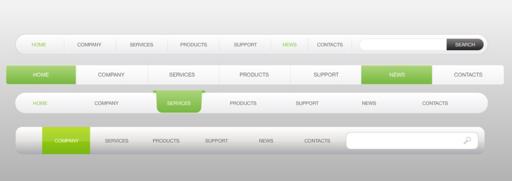
1. Horizontal Navigation Bar
One of the most common web navigation design structures, usually found at the top of a website.
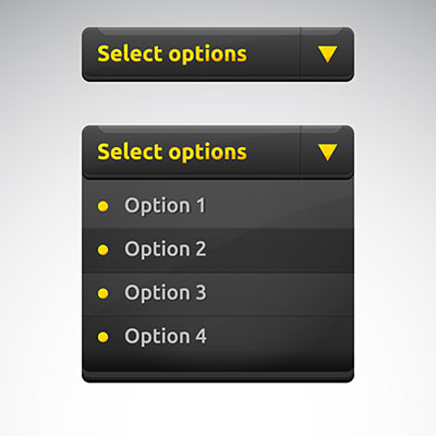
2. Dropdown Navigation Menu
Ideal for sites with multiple categories. Expands when hovered over or clicked.
3. Hamburger Navigation Menu
Used in mobile navigation, represented by three stacked lines that open a menu.

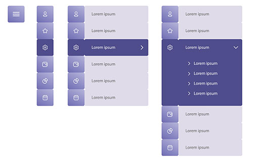
4. Vertical Sidebar Navigation Menu
Positioned on the left or right side of the screen, often used in blogs and dashboards.
5. Footer Navigation Menu
Includes links to important pages such as Contact, Privacy Policy, and Terms of Service.
How to Design User-Friendly Web Menus: 7 Best Practices
1. Keep it Simple
Avoid clutter and unnecessary elements.
2. Make it Visible
Use contrasting colors and readable fonts for clarity.
3. Create Separation
Use whitespace or dividers to distinguish menu items.
4. Only Use Buttons for Calls to Action
Avoid making menu links look like buttons.
5. Order Links by Priority
Place the most important links first.
6. Optimize for Mobile
Ensure smooth navigation on smaller screens.
7. Use Descriptive Labels
Avoid generic terms like “Products”—be specific (e.g., “Men’s Footwear”).
Get Exciting Navigation
Menu Design Templates
Make website browsing effortless with beautifully crafted
menu designs that guide your visitors seamlessly!
Call +91 88888 66110 or Book a Free Consultation today!
What Should Be Included in Your Website Navigation Bar?
- Home – A quick way for users to return to the homepage, no matter where they are on the site.
- About Us – A section that tells visitors who you are, what you do, and what makes your business unique.
- Products/Services – Clearly categorized links to showcase your offerings, making it easy for users to find what they need.
- Contact – Essential for user trust, this should include options like phone numbers, email, a contact form, and location details.
- Call-to-Action (CTA) – Buttons like “Get a Quote,” “Sign Up,” or “Book a Demo” placed strategically to encourage conversions.
- Search Bar – Helps users quickly find specific content, products, or information without endless browsing.
- Blog/Resources – If content marketing is part of your strategy, this section can drive traffic and provide value to users.
- FAQ/Help Center – Reduces customer queries by addressing common concerns and guiding users effectively.
- Login/Register (If Applicable) – For e-commerce or membership-based sites, easy access to accounts improves user experience.
- Cart/Wishlist (For E-commerce Sites) – Allows shoppers to view their selected items and proceed to checkout seamlessly.
- Language & Region Selector (If Needed) – Important for global businesses, ensuring users can browse in their preferred language or currency.
- Social Media Links – Direct access to your social platforms for engagement and brand credibility.
- Live Chat (If Available) – Provides real-time assistance, improving customer satisfaction and conversions.
Common Mistakes in Website Navigation Design and How to Avoid Them
1. Too Many Menu Items → Keep It Minimal
A cluttered navigation bar overwhelms users and makes decision-making harder. Stick to the essentials—group related pages under dropdowns if needed. Less is more when it comes to guiding visitors efficiently.
2. Unclear Labels → Use Precise Wording
Vague labels like “Stuff” or “More” leave users confused. Be direct—use familiar terms like “Services,” “Shop,” or “Contact.” Clarity ensures visitors instantly understand where each link leads.
3. Hidden Navigation → Ensure Visibility Without Excessive Clicks
Menus buried behind icons or requiring multiple clicks frustrate users. Keep navigation easy to find, especially on mobile. A visible, accessible menu reduces drop-offs and keeps users engaged.
Why Simplicity Matters in Website Navigation
A simple and intuitive website nav design makes it easier for users to find information, leading to higher engagement and better conversions.
By following these best website navigation tips and examples , you can create a seamless browsing experience. Prioritize clarity, simplicity, and accessibility to improve user engagement and SEO rankings.
FAQs
1. What is website navigation, and why is it important?
Website navigation refers to the system of links that help users explore a site. It improves user experience, boosts SEO, and increases conversions.
2. What are the best practices for website navigation?
Keep it simple, make it visible, use clear labels, optimize for mobile, and structure links logically.
3. What is the best menu bar design for a website?
It depends on the website type. Horizontal bars work best for standard sites, while hamburger menus are great for mobile.
4. How can I improve my website navigation?
Use a well-structured layout, include a search bar, limit menu items, and optimize for mobile.
5. What is the role of website navigation in SEO?
Good navigation helps search engines crawl pages efficiently, improving indexing and search rankings.
6. How does website navigation affect user behavior?
Navigation acts like a map for your website. If it is clear and easy to follow, users stay longer, explore more, and are more likely to take action. If it is confusing, they leave quickly, which can hurt engagement and conversions.
7. What are the common bad user experiences caused by poor navigation?
When menus are cluttered, hidden, or disorganized, users struggle to find what they need. This leads to high bounce rates, frustration, and lost potential customers. Slow-loading menus or too many clicks to reach a page also make for a bad experience.
8. How can website navigation improve accessibility for disabled users?
Good navigation ensures everyone, including those with disabilities, can browse easily. Using clear labels, keyboard-friendly menus, and screen reader compatibility makes a website more inclusive.
9. How can breadcrumb navigation enhance usability?
Breadcrumbs help users know where they are on a site and quickly backtrack if needed. They work like a “You are here” sign, making navigation smoother, especially for large websites.
10. How does navigation structure influence a website’s SEO performance?
Search engines prefer well-structured websites. Clear navigation helps them crawl and index pages efficiently, improving rankings. Messy or broken navigation confuses search engines and users alike.
11. What role does mobile-friendly navigation play in user experience?
Since most users browse on their phones, navigation must be touch-friendly, responsive, and easy to scroll through. Buttons should be big enough to tap, and menus should collapse neatly without being frustrating to use.
12. What is the relationship between internal linking and navigation?
Internal links connect related pages, keeping users engaged and helping search engines crawl your site better. Smart linking boosts SEO and improves the user experience.
13. How does site navigation affect website crawlability?
If search engines can easily follow your links, they can index more of your pages. Complicated menus or JavaScript-heavy navigation can block search engines from crawling your site.

Ashish Dalia is the CEO & Chief Digital Marketing Strategist at I Knowledge Factory Pvt. Ltd.

Ashish Dalia is the CEO & Chief Digital Marketing Strategist at I Knowledge Factory Pvt. Ltd.


